An Interview with Joanna Goddard – by Sian Matthews

Back in July I started chatting with artist Joanna Goddard via email about her latest works ‘The Kubb series’. Still unable to meet in person because of that virus you may have heard about, and because of a few major life events on both sides, including, sadly, a family bereavement, it has taken us quite a while to get to a point where we can write this blog. But! we got there eventually, and I am excited to share with you an inside look at Jo’s work and inspirations for this, the 6th instalment of our featured artists interviews here on the Sweet Blog.

Predominantly working with Ceramics, specifically paperclay, and inspired by artists such as Grayson Perry and Louise Bourgeois, as well as author Rosette Gault and poet Christina Rossetti. Jo uses bold colour pallets, suggestive forms and an interest in exploring the juxtapositions between materials and the viewers sensory experience to create sculpture which is both stimulating and surreal.  

If you have been following Sweet ‘Art for a while you may also recognise Jo from a previous Sweet ‘Art exhibition back in 2016 called Hand Maid in which she showed her piece ‘Swarm Of Desire, The Nymphs Headrest’. Inspired by ‘L’après-midi d’un faune’ a poem by Stéphane Mallarmé which describes the erotic desires of a faun after he encounters several nymphs in a forest.

Hand Maid was a little bit before my time working with Sweet ‘Art, so although I was aware of the exhibition I wasn’t very familiar with the works or the artists involved. You can imagine my delight when I found these photos of Jo’s works in the show, with that bright shock of orange and blue sitting proudly right in the centre. The energy and feeling that comes from Jo’s work, even just in photos, is so much fun and so vibrant that it captures all your attention, draws you in and makes you want to ask for more. So I started by asking Jo about her background. Where do these ideas come from? Why ceramics? And what’s next?

Jo’s love affair with ceramics started back in the late 80’s/early 90’s while she was studying for her foundation in Hastings, speaking on this early inspiration Jo says…

“I started using clay after my Foundation at Hastings in 1989, we had an amazing teacher called Tony Bennett who created the most incredible ceramic works, they were really amazing. He exhibited in Garth Clarke gallery in New York, and of course we were all v. impressed. It made me realise what could be done with ceramics, that it could be a prestigious material despite its basic origins. I also followed Grayson Perry’s work at this time.”

I always admired his [Grayson Perry’s] work, ever since I saw him in a magazine and realised that it was possible to put pictures on pots. That literally fired me up and I was into monochrome for many years – although there were many times I could have used more colour, I was strangely scared of it.”

She carried this motivation and her ideas over when she started studying 3D Design, Ceramics at Surry Institute for Art and Design, and later, while working with a mould making studio in London to get larger works made and fired. Jo would even transport works to London from Brighton by train as local studios were not keen on sharing firings!

Eventually Jo received some grant money which enabled her to buy her own kiln, this in turn meant that she could create more ambitious, larger scale sculpture and for the first time, start trialling colour in her works.

“Once I got some grants and a kiln, I was able to start experimenting, and finally colour came along! I did many group shows and even took my work to Holland to exhibit. I had loads of outdoor shows, and really enjoyed it. Slowly my work got larger and brighter – the Population series was the heaviest and I realised that I needed to find a new material. I corresponded with Rosette Gault whose investigations into Paperclay were just beginning. She inspired me to use it – and it gave me so much freedom, work could be made/stopped/restarted and it was really liberating. I really loved the Breakfast in Fur, the cup by Méret Oppenheim – that confusion between touch and texture – really excited me. Inspired by this many of my pieces looked like they were made of foam”

Jo’s work morphed yet again in 2006 when she became a mother. From a mix of sleep deprivation, working around her baby’s needs and drawing inspiration from the poetry of Christina Rosetti and The Dolls of Hans Bellmer, the Nymphs Headrests were born, as well as a series of other works in orange.

With motherhood arriving in 2006 my work did change – any mother will know that enough sleep & successful breastfeeding is a holy grail concocted by the devil!! Out of this time I made the Nymphs Headrests and a set of other orange works. The poetry of Christina Rosetti and dolls of Hans Bellmer were big inspirations – no coincidence that I visited the Bellmer exhibit at the Whitechapel with my baby – some raised eyebrows there but he slept through it all! The first 10 years of motherhood were good for my work – but as the kids got into the pre-teens, I found my work getting darker – blue came in, along with metal tones and harder surfaces.”

Nymphs Headrest

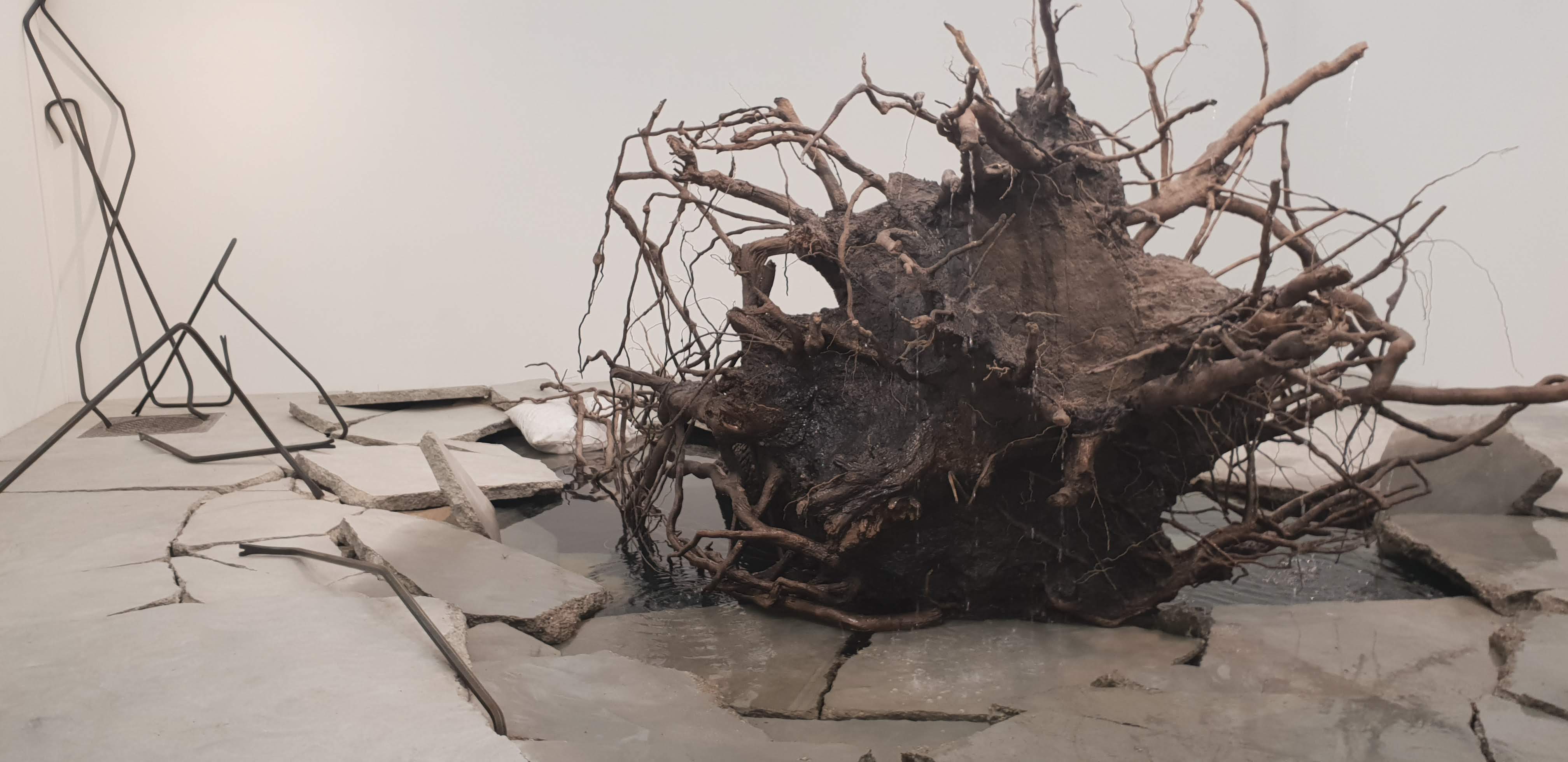
Which I guess leads us to now! Quite recently Jo has been working on a new series of work; The Kubb Series. (A quick google of the term Kubb reveals that it is in fact a lawn game, similar to bowling or Horseshoes, which has its origins with the Vikings.) These works are much larger, supersized versions of ancient gaming pieces, “Something you can really get your hand on!”

When Jo showed me these works and explained what they were I got quite excited! I love anything linked to Viking history so I was keen to learn more. I asked Jo about her recent changes in inspiration and her move to a darker colour pallet, as well as her hopes for exhibiting in the future.

Q – At the very beginning of our chat you mentioned that with your most recent work you have had a change of inspiration, working with darker colours and tones, as well as changing the materials you work with to better fit around your commitments. Can you elaborate on that a little?

“For the past 10 years, I have been making different work, working with scale, proportions and deeper colours. This started when I read the poem Goblin Market by Christina Rossetti. I got excited about darkness again, a good darkness of velvet shadows and a deep blue twilight feeling. It’s also about the tactile and being inspired by things that people touch, like the Boli figures (from Mali) or viking games. I am excited by the intimacy of those original things that people handled. I also used to work in a castle and sometimes was allowed into the cellar archives to look into boxes of old skulls and pottery, memories of that came back to me. I have also been inspired by my late mother Sandra’s collection of folk songs. Growing up hearing her sing these dark and sometimes brutal storylines has given me much inspiration over the years.”

Q – It’s clear from the descriptions on your website that you have been inspired by all sorts of things over the years but have there been any subjects or themes which you find yourself coming back to often? or which seem to run through your work by themselves without intention?

“I have always enjoyed the juxtaposition of materials and sensory experiences. Mainly where you look at something and imagine it feels like one thing but in fact and when you actually touch it it feels like another.

The artwork which started this off for me was Méret Oppenheim’s cup called Object, I may have already mentioned it. It’s a very strange piece because the more you look at it the more it confuses your mind, I spent a long time looking at it in the Tate.

I also was very drawn to Jeff Koon’s Rabbit which hypnotised me in a gallery in LA.  So for the ’90’s I was making brightly coloured ceramic work that looked like soft fabric toys or foam, to play with that type of sensory perception/confusion. There was also a sensual  element at play, like in the Nymphs Headrests which I made while my children were infants. Motherhood definitely changed me!”

“I often end up making some quite phallic objects but I dont think of this while making them. Mind you I do fancy having my picture taken like this one of Louise Bourgeois with one of my works tucked under my arm!” 

Q – Looking at the images you have sent of your most recent green works, they feel like very organic forms, almost like they created themselves. But I’m interested to know if you have an interest in or have been researching ancient monuments/structures or cultures? they remind me a lot of the upright stones at Stonehenge or the stones at Avebury, all be it on a smaller scale.

“On a visit to the British Museum I was looking at some Viking gaming pieces – small, bronze and worn by the passage of time and hands.

Studying them, I thought that they were like the most perfect of sculptures – if only they were larger….

Then on a family trip to Lindisfarne the exhibits there also drew me into the story of the Viking incursions into England, and how they would have carried these type of gaming pieces about their person.

The objects use – to bide their time when they weren’t rowing boats or fighting, made me realise how little of this side of their society I knew about. There was something very intense about the intimacy of the objects, and that excited me to make these three green works”

“Also As a child I visited Stonehenge and remember touching and laying on the stones, and I also, as a teenager I slept one night in West Kennet Long Barrow, Wiltshire. Being up close and personal with these ancient stones has definitely influenced me, I love the combination between something that looks monumental from a distance but still draws your touch. Modern monuments are always up on a plinth, but these older ones seem to grow from the earth and like a tree you just want to get your hands on it.

Q – Is this new work site specific? And how does the environment the work is placed in influence it? For example would you like one of these pieces installed on a certain hill because of the light interactions, or because of the way it would disrupt the landscape, maybe?

“I would love to exhibit in a forest again – I really like the way the light changes through the trees and that the view of the work changes as you move through the forest.”

Q – Going back to the materials you use, do they impact or manipulate the shape and texture of the piece at all?

“The clay I use is paperclay and it does make me create more solid work, in the way that I construct it all in sections over time. The joy of the paperclay is you can work for a bit, pause then resume, which works well around my kids, job, life. It also means I don’t have to rush. You can make fragile works but I have chosen not to, so the work is much more robust to handle and fire.”

Q – If these pieces were placed in the landscape what reactions do they have from people walking by? (or what reactions would you like them to have?)

“People are often saying that my work looks very pleasing in the landscape – the intimate (less than 60cm) size gives them an intimacy that draws people in – and the material, clay, always draws a comment that they are very “natural””

Q – Do you have any plans to exhibit them outside? And how do you think showing them in a more “traditional” white cube space would change the works and the way people interact with them? (for better or worse)

“I am currently approaching some outdoor venues / cafes and also rural business centres to see if they are interested. Its early days, with C-19 concerns holding things up, but I am keeping up my work on this idea.”

Q – Where do you want to take the work next? Do you have any ideas or plans for new sculptures?

“I am keen to continue working to 60cms, and beyond. I am dreaming of sleek monoliths, moonlit sculpture trails, creating a wooden dome and erecting it in a forest, to exhibit in. Family commitments are a constant draw on my focus but I will continue to make and show my work – who knows, I might sell some pieces if I’m lucky!”

Like most artists Jo also has a few other creative projects on the go! And naturally I had to ask about these ventures and how they fit into her wider body of work…

Q – I remember you also mentioned that you have a few other side projects going on including prop making and sewing. Both of those things seem very different from your ceramic works! How do they fit into your creative bubble? I have been experimenting with sewing and embroidery myself during lockdown and have found it a really good way to relax and “zone out” from all that is going on in the world for a while. Is that similar for you?

“Sewing – specifically quilting, has drawn me as I have only a few decisions to make, then the rest is just work. It’s very different to making a sculpture. You can recut, revisit, resew. With clay there is a finite point, there is no unpicking. So, I found that by doing sewing in the much colder months, I could rest my clay/art making brain a bit. I use a 1930s manual and 60’s electric machine then I hand tie (sew the sides of the quilt together). This involves having a 6” frame in the front room for months, while I work on it every evening. Each triangle gets three stiches in the centre then I move through to the next triangle/space, it’s quite time consuming.

The prop making was done from around 1997 to 2006 for Vavavavoom! a burlesque event lead by my friend Stella Starr. It was really inspiring and great fun, as well as hard work. Again, it was different from making sculptures and great to work to a brief, we had a great understanding of the visual impression of the costumes and props and hope to showcase them again in the future.”

And Finally, I couldn’t finish this feature without mentioning Jo’s dad Lawrence, who sadly passed away during preparations for this blog.

Lawrence helped advise Jo with technical challenges, drove artworks to exhibitions and was a sounding board for her ideas, even if he was slightly bemused by what she was making!

He will be greatly missed.

Jo and dad Lawrence. Taken at a group show at Into You Tattoo in Brighton in 2011

You can also visit Jo’s website and her Instagram for more!

Lockdown Art, part 3 – by Sian Matthews

Following on from Charlotte and Corrina, and a couple of months into lockdown I’m here to share the artworks I see every day in my own home. Like many people right now I am missing visiting galleries and museums. As much as I am enjoying seeing everyone share their work via social media and think it is brilliant that galleries are making their collections available online (including our own online show!), there is nothing like experiencing great art in person (and lets not forget the social aspect of gallery visits!).

I am definitely very fortunate to own and be able to display art in my home and the extra time I have found myself with as of late has meant that I have been able to appreciate it more than I would have under “normal” circumstances. A large amount of the art I own also means something to me on a personal level, most of it created by friends or linked to past experiences and memories, it has helped me feel connected to the world beyond my own four walls in these trying times.

Main gallery wall.

First up are two of the four portraits created of myself at our second ‘Intersect portraiture project’ on IWD 2019. These were drawn as the practice round by our artists before guest sitters arrived, to get acquainted with the process and with each other. The other two drawings from this sitting are safely tucked away in storage, not just for space reasons but also because its probably a little narcissistic to have a whole wall full of images of myself above my bed, right?

Next up is a print by artist and illustrator Steven Rhodes which is actually a birthday card from a friend which I framed on account of it looking a little like me and my cat Phoebe.

Two of the artworks I own were made by friends while at University and were destined for the skip after being exhibited at Free Range in 2016 due to a lack of storage opportunities. Obviously I felt awful that my friends were having to bin the work they had poured all their efforts into the last few months and which had earned them their degrees so I saved what I could. This ended up being ‘Red painting on wood’ by Kinga Pilarska and 1 of the hundreds of random Gnome heads created by and scattered around by Robin Gosselin-Monasevic.

Another artwork hanging on my wall and created by a friend is this print by Jess Nash, who you can read more about in my previous blog “An Interview with Jess Nash

Anyone who knows me, knows that I have a ‘thing’ for print making, especially etchings, woodblocks, lino, and cyanotype. I always appreciate the processes of making the art work, sometimes more than the final outcome and the piece itself! which is why printing in all it’s forms, watching artists carve and mark blocks, as well as exploring these processes myself in my own work appeals to me. So, you could imagine my excitement when I discovered printmaker and tattoo artist Lacey Law on Instagram. Her work is often much more figurative than I would usually be drawn in by, most of her woodblock prints are tattoo flash in a different medium to the typical drawings on paper but I adore them.

Back in 2018 I was lucky enough to receive an edition print of ‘Comfort’ for my birthday from my partner and it has held pride of place on my wall ever since. I have been watching her carefully on Instagram throughout lockdown, (watching her carve blocks is oddly satisfying) and have been dying to get my hands on one of her smaller prints she has been making on paper scraps, but her work sells out in minuets and I have just not been quick enough…. Yet!

Do you know of the Stoned Fox meme? Chances are you have seen it somewhere even if you don’t know what it is first-hand, this taxidermy fox is a viral hit and has literally travelled the world. His creator Adele Morse is an artist working in London who specialises in sculpture and taxidermy. Since the original fox went viral Adele has made many more anthropomorphic critters including a raccoon, a hedgehog, some rats, many more foxes and a little goat named Billy, who also recently became a viral sensation in Morocco for being the spawn of Satan/witchcraft/a summoned demon of some sort (You couldn’t make it up!).

Last year Adele tried to get her original fox back from some people who had broken him and generally treated him quite badly, the catch was that to get her own artwork back she was going to have to buy him back. To raise the funds for this a friend of Adele’s set up a GoFundMe to bring the fox home! For a small donation you would be sent a print of the fox and the knowledge that you helped an artist regain some control of her own work.

At one of the 2018 TOAF fairs two illustration students turned their stall into a participatory project, inviting visitors to have their animal portrait drawn. I still have my cat portrait framed on the wall.

Because of recent development work in the town, last year a group of artists and designers in Harlow found themselves having to say goodbye to their studios at Gatehouse Arts. The decision was made by Abbie and Harry at SnootieStudios to put on one last goodbye show in their gallery in which they celebrated the work created in the studios as well as works by artists who have had a past connection to the studios and gallery or who just live and work in Harlow. Having grown up in the town and previously working on an exhibition in the gallery with a group of friends back in 2015 I was able to submit and exhibit my own etchings in the exhibition along side many others.

For the Private view Abbie and Harry made their own home brew beer in the bathrooms of the studios and bottled it in vintage (unused) medicine bottles and printed up their own labels, naming their creation ‘good booze’.

I’ve known Abbie and Harry for many years and this eccentric idea and design is so typically them, I had to keep a bottle! It now sits proudly in my kitchen with Audrey, my Venus fly trap… because why not?

And lastly, for this blog anyway, sat on my bookshelf is a memento from the first exhibition I was involved in with Sweet ‘Art. I created these 3D representations of the Femfest posters by casting a real Femfresh bottle in plaster and then painting. Originally created as special press invitations we also had a few on display at the exhibition itself, do any of you remember them?

There are other artworks scattered around the house, including some of my own work so maybe if this lockdown carries on much longer I’ll do a Lockdown Art part 3.5 and show off a few more examples but for now, I hope you’ve enjoyed snooping around my collection!

Art Pilgrimage – by Sarah Kingham

I have spent at least an hour today queuing to experience art. Firstly, because I mistakenly got to the Hayward Gallery an hour before it opened, so I passed a peaceful 40 minutes in the National Theatre expresso bar watching a man stick lines of dots to the windows. This seemed to presage the second part of my day, at least in retrospect. There was a small line of people waiting at the door to the Hayward when we returned at 10:58am.

Then I queued because I waited in line twice to commune with pieces of art. The first of these was Richard Wilson’s 20:50. The work is so popular at the Hayward’s current show, ‘Space Shifters’, that the ticketing staff advised us to go straight to see it, before the queue built up. That they gave this advice to everyone entering the show possibly nullified its efficacy. None the less, we chose to follow it.


There was a queue of around twenty people on the first floor. We joined it. A series of tape barriers showed that the queue could be four times longer later in the day, when things get busier. Out on the roof garden a huge convex, blue tinted mirror by Anish Kapoor reflected the clouds. They never seemed to move while I looked at them. It was peaceful; the air was heavy with the odour of sump oil and anticipation. As we approached the work, laminated health and safety sheets were handed out. We needed to remove coats and bags (there was a pair of storage boxes, like those in theme parks, before rollercoasters). If we got vertigo, we should look out of the window, but definitely not grab the sides of the path into the work; the oil in 20:50 goes right to the top of its container; the edges curve in voluptuous surface tension.

anish

Sky Mirror, Blue – Anish Kapoor

I absolutely love this piece. I first saw it in the second incarnation of the Saatchi Gallery, at the former GLC County Hall building. There it reflected the Edwardian splendour of the top two-thirds of a high windowed and wood panelled room back to itself, darkly. The realisation that the surface is flawed, marred by tiny motes of dust, does not detract from its black splendour. How deep is it? You imagine it could engulf you. Surely the director of ‘Under the Skin’ must have visited it at some point and sublimated its darkness as a future image to use. The space at Hayward is truer to the first conception of this site-specific work, a white cube lit by a grid of skylights. On the far side of the room, the oil continues through an open doorway and out of sight. The path cut through the slightly more than waist deep pool of oil narrows as you reach the centre of the space. (Surely it’s only a few inches deep? Otherwise the weight would bring the building down.) Despite the queue, and the gallery assistant hovering, I felt awe. It is a rare man-made exemplifier of the sublime. I was sad to hear that Saatchi sold it to a Tasmanian museum in in 2015. Two versions can exist simultaneously, one there and one on loan. I wish the Tate had bought it. They could’ve filled the ground level of the Turbine Hall with it. Imagine it installed in the whale gallery of the Natural History Museum.

dynamic-efab1013-9515-52fd-a189-dff78b1a5204

20:50 – Richard Wilson

Later we went to Victoria Miro Gallery. Somehow I had managed to secure a timed ticket to see the Yayoi Kusama show. I’d originally had two but their website had crashed before they were processed. Kindly they allowed themselves to be persuaded to let my friend in too. We queued into the building and were handed dot-covered passes to the infinity room installation, ‘My Heart is Dancing into the Universe’; these were also laminated. We queued up some stairs. The top floor of the gallery is a reclaimed industrial space with grey concrete and exposed beams, supported by an iron girder. We agreed that it was like queuing for something at a squat party. It was a long queue, and we had a lot of time to talk.

I first came across Kusama at the start of the new millennia, at a big Serpentine retrospective, her first in the UK. She’s one of those artists who fascinates through living her art as much as making work, like Kahlo or Warhol. Her New York happenings, her now self-imposed seclusion in an institution; the way that she chooses to embrace her overwhelming hallucinations, covering her work (and her costumes) with a riot of seething dots, multi-coloured or black on crimson or primary yellow, undulating with the forms they engulf. The Serpentine show also had an infinity room (possibly a box rather than a room; I remember something smaller). Mobile phones didn’t have cameras back then, so no one was taking selfies.

hqdefault

Still from one of Yayoi Kusama’s 1960’s performances

When we reached the threshold of the infinity room at Victoria Miro we were shown a plan of the L-shaped space. We must follow the path, staying within the low barriers that delineated it. Rather facetiously (or hopefully) I asked if anyone had strayed off the path and become lost in infinity. No, but apparently a few people had blundered into the installation.

Inside it was a fairyland of black paper lantern spheres suspended in darkness. Each one was patterned with large dots that glowed through a range of colours, pink into purple or yellow into green. The colour changes were gradual. There seemed to be a whole universe of them falling away from us. We gawped and took some photographs (including, I’m afraid, the now obligatory ‘art selfie’). Seemingly seconds later the gallery assistant told us it was time to move on. We had to leave so the next person or pair could be entranced by it. Later I realised that another highlight of the Hayward show, the installation ‘Narcissus Garden’ was also by Kusama.

cw-29665

Infinity Mirrored Room – Yayoi Kusama

It was impossible for many people to get tickets to see the Kusama show, which is a pity. I hope she gets another UK retrospective soon, it’s been eighteen years since the last one and she turns ninety next year, still prolifically designing large scale sculptures and painting dazzlingly intricate, vivid canvases, examples of both of which were on show at the Miro. The Hayward show is well worth a visit; there are many fantastic pieces there, and they interact wonderfully. Perhaps queuing for these works intensified them; we live in an age of instantaneous gratification, and the novelty of waiting added to the experience. I would have liked to have longer alone with both works, without the pressure of a queue behind me, but you can’t have everything.

Space Shifters was at the Hayward Gallery, South Bank and closed 6th January 2019

Yayoi Kusama; The Moving Moment I Went to the Universe was at Victoria Miro, Wharf Road, closed 21st December.

The problem with Frieze Week ’18 by Sian Matthews


That title is a little misleading because I did actually have a really great time at Frieze London. It has been over a month now since the fair and I have had plenty of time to contemplate it all, although there is one thing that has been playing on my mind that I would like to discuss. But let’s start on a good note! This year was my first time attending the art fair itself, although I have explored the sculpture park in previous years, and thanks to Sweet ‘Art I had a press pass!

This year Frieze week had a huge focus on women in the arts. Frieze itself commissioned some large-scale artworks, installations and performances such as Tatiana Trouvé’s ‘The Shaman’ (pictured below) a 1.2 tonne bronze tree and water pump. It was one of the first things I saw as I went into the fair and it definitely commanded the attention it was receiving.

20181004_123631

At the other end of the fair there was a curated section of stands showcasing the work of 9 female artists who had used their work as a form of political activism in the 80s and 90s called ‘Social Work’ I quite enjoyed Social Work as it was diverse on all levels, including race, age, backgrounds and even mediums and subject matter. The section included artists such as Nancy Spero, Helen Chadwick, Berni Searle and Ipek Duben; artists who use the female experience and themes of sexuality, gender, alienation and identity to challenge both aesthetic and political conventions. It worked really well and was an insightful look into the practice of some very influential artists. I was also lucky enough to wander past just as Sonia Boyce was giving an interview about her work! (I won’t lie, I felt a little starstruck!) It was fascinating to listen in and hear what she had to say about the motives and messages behind her work and what she thought of Social Work itself.

The stand I connected with most in Social Work was the Pippy Houldsworth Gallery who were showcasing the work of Mary Kelly. ‘Interim Part 1: Corpus’ is the culmination of 3 years of documentation by Kelly of conversations she had with women of her generation and displays their words in first-person text panels alongside screen printed images of fashion ads and medical photography of ‘hysterical women’. It feels personal and almost candid in its delivery, you get the feeling you’re reading something like a diary entry, something you shouldn’t be reading, and I appreciated the fact I was being told something so intimate.

The one thing that really disappointed me about Social Work is that it was hyped up quite a lot beforehand, but then felt like it was squished into a corner at the actual event. I would have preferred it to have had a more prominent spot in the fair.

Another nice touch to the fair this year was a fund-raising event hosted by Tracey Emin in the form of a postcard auction, with the proceeds going to women’s charities. Although unfortunately I didn’t manage to catch any of it!

Elsewhere in the city, galleries such as White Cube, Victoria Miro, the Parasol Unit and even the RA celebrated women by opening exhibitions and installations of works by artists such as Yayoi Kusama (who I love but sadly missed out on tickets for!), Cornelia Parker brought her PsychoBarn installation to the courtyard of the RA, Heidi Bucher and her beautifully haunting latex skinnings, and Doris Salcedo (pictured below) at White Cube. Women really did take over London for Frieze week!


On the Friday night I attended The Other Art Fair which also had a whole section dedicated to female artists. They had their own building across the road from Victoria House which was designed to be a statement called ‘not 30%’ to draw attention to the fact women typically get only 30% representation in art fairs. I thought it was a great idea (although I wasn’t sure about segregating them in another building away from the main event), and there was a diverse selection of work, from painting and sculpture to taxidermy and even tattooing. I so badly wanted to get a tattoo by artist Emily Malice but I missed her by a couple of hours as Friday night was the only time she wasn’t there! (maybe next time!)

Whilst we were there we also met two recent graduates who had turned their stall into a fun and inviting participatory project.  As Illustrators, they were drawing visitors to the art fair as any animal of their choosing for a small donation, so obviously we had to take part! See us below as a cat, a leopard and a jellyfish!


Overall I think The Other Art Fair may have been more enjoyable on a social level. More interactive, more inviting, it was more appealing to a wider spectrum of people. Dare I say more inclusive?

All of this sounds great doesn’t it? Women finally getting the recognition they so badly deserve. So going back to my clickbait title, where is the problem?

What has been playing on my mind is the idea that all of this new attention from large institutions, galleries and companies is just a form of box ticking, it felt like they were just ticking women off their inclusion list. I am not really sure of the exact thing that made me feel like this, maybe it’s the fact that both art fairs felt the need to over-publicise their inclusion of women and make a song and dance about it as if for attention; to be seen to be doing the right thing instead of recognising the issues faced by female artists, educating themselves and making the necessary changes. Obviously, I’m not saying we shouldn’t shout about the needs and rights of women in this industry, its massively important to talk about it! There was just something about Frieze week that made me feel like the motives behind it were off.  As you all must know by now, 2018 marks 100 years since the first women in the UK won the right to vote. This means that women’s rights are very much the theme of the year. It means that right now equality and women’s rights seem to be a bit of a fashion statement unfortunately and these companies need to be seen to be doing the right thing or they face huge backlash.

While I think its amazing what happened at this year’s Frieze week, and I certainly do not want to belittle the success of the artists featured. I can’t shake the feeling that we should all be a little wary of the motives and the intentions behind this sudden push for women. I am worried that next year this will all go away and no real progress will have been made. I hope I am wrong.

I have taken a photo of an article written in the free art news paper given out at the Frieze art fair itself which I feel sums up my feelings well and highlighted certain points for you. I feel it quite clearly explains why the focus of this years Frieze week only felt skin deep.

20181113_143230.jpg

Let me know what you think, am I just being pessimistic? Did you visit Frieze or any of the other events going on that week and what was your experience? I’d really like to know.

Turner Prize 2016 by Charlotte Elliston

In the lead up to Frieze week, I decided to go and check out the 2016 Turner Prize at Tate Britain. Having heard that for the first time, 3 of the artists in the running to win the prize were female, I was interested to check out the works on show.

img_20161001_140608

Another first for Tate was to allow photography in the exhibition. Someone clearly has seen the opportunities for social media within the exhibition, and realised the selfie potential from the works on display!

The first room presents the artist Helen Marten (who also has an exhibition on currently at the Serpentine I now want to see). Her sculptural works are assemblages of found and manipulated objects – a mixture of the domestic (cotton buds, eggs, money, fruit) and the esoteric (a shed snake-skin?). The blurb from Tate says each sculpture is meant to suggest a “workstation or terminal where some unknown human activity has been interrupted” but both the shapes and randomness of the collections in each piece reminded me more of an animal creating a den or home – the way a bird will collect items purely for shape and colour, with no knowledge or interest in their previous use.

img_20161001_160050

An aspect of Helen Marten’s work I did find curious, and which none of the reviews I’ve read mentioned, were the curious artist-made aspects of the work. In places, it was evident that metal and plastic had been worked by the artist to form shapes. The most obvious of these was in the first chrysalis-like sculpture formed of interlocking metal parts. Within this sculpture were shapes very reminiscent of a vagina dentata – imagine if Marnie Scarlet’s Vagball from SHE had teeth – this is how clear the reference seemed, to me at least, and yet no mention of this anywhere in the literature I have yet read.

img_20161001_150126

Next up was Anthea Hamilton’s work and yes, this is the most ‘grammable piece of work in the exhibition, with visitors posing in the ‘crack’ for photos. The piece Project for a Door (After Gaetano Pesce) was created from designs for a New York apartment door through which people would enter. It is possibly a comment on social housing – those of lower social status would have to enter via the rear, but here, in a gallery space, being photographed by affluent visitors, seems to lose any of this. Perhaps if visitors to the exhibition had been forced to actually walk through the doorway it may have been different.

img_20161001_142322

I preferred this piece of Hamilton’s work. A brick print suit set against a brick print wall. With references to surrealism, and hints of the nature of camouflage, I also felt it referenced ideas of invisibility, blending in, and the way clothes can enhance or deflect notice.

The third room was dedicated to Josephine Pryde, with a mainly photographic display. I had read the text handout on the artist before I entered the room and was excited by the sound of her new works created by Pryde, where she “placed objects on the back of the worktops, and then exposed them to sunlight in London, Athens, and Berlin” as I love a photogram, and was intrigued by the introduction of the domestic – expecting something similar to Běla Kolářová’s work  seen in Double Take earlier this year. I was quite disappointed in the actuality of the piece, where mostly vague shapes were seen on vague backgrounds. In one piece the artist had clearly imposed the word ‘Jo’ herself, and the most interesting of the series was the piece where a griddle had been placed a few times on the worktop, leaving a geometric design.

.img_20161001_154703

The other half of the room was taken up by a scale model of a graffiti covered train, and photographs of hands interacting with objects. These were created to resemble advertising or fashion images but just arranged as to display hands at the point of touching an object – pine cone, lamp, etc. The most noticeable thing for me in these images was the large number of electronic devices chosen – phones and Ipads seemed to dominate. Perhaps this was even more noticeable now that everyone was photographing all of the works in the gallery (yes, I was one of them too!)

The final room led to Michael Dean’s installation. Entering the room, visitors had to negotiate bits of metal, cement chunks and debris which led round into the centre of the room. Bent metal poles and chains formed half-letters, possibly spelling out variants on the word SHORE, which was also present in stickers in the walls and papers on the floor. Hands and fists emerge from piles of rubble, as if trying to escape from a cave-in.

20161001_134202

In the centre of the floor is a huge pile of pennies. This is titled United Kingdom poverty line for two adults and two children: twenty thousand four hundred and thirty six pounds sterling as published on 1st September 2016 and is £20,436 in pennies. The government states that this is the minimum a family of 4 require to live on for a year. When installing the piece, Micheal Dean removed one penny, meaning that this family would now be below the poverty line. What strikes me most about this installation is how little the money looks. Although a large pile of pennies, I would image £20,000 worth of pennies to fill a swimming pool, not a few meters of a gallery floor. The installation as a whole seems more thoughtful, political and relevant to the current UK zeitgeist than the other three exhibiting artists. Whilst I loved Hannah Marten’s strange sculptures, I am rooting for Michael Dean to win.

img_20161001_162403

The Turner Prize is on until 2 January 2016 at Tate Britain

Helen Marten: Drunk Brown House is on until 20 November 2016 at the Serpentine


Studio Visit with Artist Sophie Wellan – by Corrina Eastwood

I first came across the work of Sophie Wellan when I was asked to judge on the panel of the British Women Artists Competition in 2013. Struck by the power of her work, along with the rest of the panel, Sophie’s installation ‘This Too Shall Pass’ was selected as a judges favourite.

A decision to indulge further in the intrigue evoked in me by Sophie’s work came when Sophie was also chosen by the Sweet ‘Art selection panel for our upcoming show Seams, and a studio visit then felt in order! I now find myself again considering the visceral nature of Sophie’s work and its ability to command the viewer, packing a punch while simultaneously sweetening the blow.

The work itself not only provokes in me a tenacious desire to investigate the found objects themselves, asking questions such as ‘Where did these objects come from?’, ‘How did they come together?’ and ‘What history do they hold?’. I am also left wondering about the artist herself, what part, if any, of the very personal sense I gain from these works is her and how willing would she be to reveal herself through them.

Dark is a Way, Light is a place.

Dark is a Way, Light is a place.

I imagined before our interview that Sophie may respond that she is every bit of the works, yet paradoxically also none of them. With her artist statement reflecting an interest in the metaphysical and “a connection between all things” I wonder if for her, despite the incredible craftsmanship and attention to detail evident in their execution, that they can be both everything and nothing.

This ‘connection’ is something I strongly feel with many of Sophie’s works yet with some this also leaves me feeling uncomfortable. There is something hypnotic, something that is both comforting yet toxic, like a pain that can feel like home.

The clinical nature of ‘This Too Shall Pass’ meets a tension in its seeming desperation to order chaos, to muffle pain and to fix the unfixable. The result is an incredibly moving testament to personal connection and all it can or cannot be, or heal.

This Too Shall Pass.

This Too Shall Pass.

pass_2

This Too Shall Pass

This Too Shall Pass

I have questions for Sophie that may lead to some answers about her practice but I wonder if for me her works may still remain like ghosts, with there being a strong and often chilling sense of the desire to communicate, yet despite this you are left with a certainty that you may never quite grasp the ungraspable.

How long have you been an artist and what drives your practice?

I have always created, throughout my life, although it is only in the last 17 years I have realised my passion for materials and the language within them. This is what really drives me to make the work that I do. The essence of the material is what I am trying to discover and how it speaks and then how that language might change when one material is juxtaposed with another.

What was the last exhibition you visited by another artist and what were your impressions?

The last exhibition I visited by another artist was by Roseanne Hawksley, a sculptor whose work is often to do with war and death. I love her work as it is not only poetic but also beautifully crafted, she manages to create a great beauty from materials such as animal bones. Roseanne is now in her mid eighties and is still working; that is also really impressive, and how I would like to be.

There is a great spiritual sense in your work, a sense of a communication of the past in the present through the use of found objects. Can you say a bit about that and how it has become important in your work?

I am aware of the sense of the past in the present within my work, and I often wonder where it comes from. All I can think of is that as a child my mother would drag me around museums, especially the British Museum looking at relics from the past. I can only recollect not liking it at the time, but these things stick and come out somewhere (Ironically, the British Museum is one of my favourite places to visit now). It has been suggested in the past that some of my work has the look of something that might have been found in an ancient dig somewhere, with an ancient quality to it. Most if not all of the materials I use have always been part of the natural world so we intrinsically know them and on some level I believe, will feel connected to them. I feel strongly a sense of the spiritual nature within a material. It is the material which evokes, and I think that by putting the materials together to form a symbolic object which speaks of being human (a shoe, a dress or a cloak) it immediately connects us on that level. My favourite book which talks a lot about the spirit within a material is ‘The Nature Of Substance’ by Rudolph Haushka, a beautiful old book for anyone wanting to learn more about this subject.

I find your work incredibly visceral in its ability to emote. How consciously is this an intention in your creative process and do you have a surfaced awareness of your work speaking on many levels?

I guess any art is fundamentally about communication. My most recent work ‘As Above So Below’ series speaks on many levels, with ideas of how everything in the universe is connected from seeds to metals, to crystal formation to star constellations and the energetic pathways in our own bodies. However, I am also trying to describe how I personally feel amongst all of this on a more spiritual level. The work came out of a time in my life when I wasn’t able to sleep and would go into the garden at night and look at the incredible night sky in its vastness, terror and glory. I guess the work is about how it made me feel.

For me your work is interesting because it has such a paradoxical sense of beauty and calm but also feels somewhat uncomfortable to view. Can you say a bit more about this and if it is how you intend the work to be received?

I feel that for me to create a piece of work which I think has succeeded in some way, it needs to possess a dynamic tension. I love to create beautiful things, I am very aware and in awe of the beauty and majesty within the natural world, I am also aware that that is not all there is. The discomfort felt viewing my work might well be touching on a collective angst. My work is a way for me personally to attempt to work out the difficult questions of life . It is always really exciting and reassuring for me when somebody ‘gets’ what I am doing. It reminds me that I am not alone.

Shipbuilding

Shipbuilding

You can see two pieces of Sophie Wellan’s work exhibited at Sweet ‘Art’s upcoming show Seams running form the 13th -17th September 2014.

Corrina Eastwood